Wednesday, January 3, 2018
Pretty in pink
Daily Painting Challenge - Day 3
For this painting I decided to try lighting the vase from slightly behind and to the left, and to simplify things, to stick with one overall colour for the background. You can can't go wrong with aqua as a colour to accompany flowers I think.
In this painting I almost ended up with a few 'lost edges' (term for where the colour of the object and it's background are the same). I like the effect. The vase is almost like a water drop.
I've been taking a look on facebook at some of the work entered by other people so far, for the 'January 31 day #stradaeasel challenge' (same challenge I'm attempting). A lot of people have been painting outside... it's down to -15 degrees Celsius out there! Hat's off to those brave enough to take on the elements but I think I'll stick to painting inside!
(8 x 8 inches)
20 x 20cm approx
Oil on Gessobord
Tuesday, January 2, 2018
Rose Buddies
Daily Painting Challenge - Day 2
Two roses from the same bunch as yesterday. This bunch was picked up from Trader Joes - one of my favorite places to buy flowers as they have such a nice selection at a reasonable price and the flowers always look more natural than some you buy these days. I wish they would state the name of the variety of rose though. These are so pretty - a sort of variegated red, peachy colour. The glass was a bit of a challenge - I tried not to fuss too much with it. I'm trying to put down a brush stroke, then leaving it alone.
(8 x 8 inches)
20 x 20cm approx
Oil on Gessobord
Monday, January 1, 2018
New Year's Rose
Daily Painting Challenge - Day 1
So it's January 1st 2018.
This year I had fully intended to give myself a challenge: starting February 1st, I was going to try to complete a painting-a-day every day for 30 days.
I tried this once before but only managed around 15 paintings.
THEN someone posted this on facebook - a company called Strada are having a competition to win one of their easels - to paint thirty paintings in JANUARY.
So here I am, starting in January instead.
This is my first painting.
My personal aim with this challenge is:
1. To speed up my painting time
2. To loosen my brushstrokes
3. To not worry so much about composition.
4. To get into a habit of painting every day.
5. To stop procrastinating.
I'm not aiming to complete a gallery quality piece with every painting but I'm hoping to learn something in the process and hopefully knock one or two paintings out of the park along the way.
There is always something to do everyday that stops me from painting, so I had a good studio clearout and have resolved to let the washing-up and housework wait (it's going to be a messy month).
(8 x 8 inches)
20 x 20cm approx
Oil on Gessobord
I added a little tour of my studio to this blog. Check out the tab above or click this link:
STUDIO TOUR
Monday, December 4, 2017
Merry and Bright
The title for this one is the same as the Christmas Holiday Card I'm sending out this year. Just ordered them so I hope they are back in time for me to mail them out (snail mail that is!).
Above is the card.
Here is the original painting:
You can see that it's a bit stark and featureless top and bottom. That was deliberate so that I could add lettering later. Obviously I won't sell this painting. I think Christmas paintings are a bit seasonal anyway.
It's so busy, busy, busy right now.
For the past 2 years I have been on a committee that welcomes new residents into our town.
This year I have offered to host a seasonal drinks party in my home - this weekend...gahh! Lots to do to get ready for that.
Plus with Christmas coming up and guests arriving we have been trying to finish all of the odd jobs around the house. It's hard to fit in painting when you have other things to do.
Also just finished a big commission, which I will post soon.
(12 x 12 inches)
30 x 30cm approx
Oil on Gessobord
Thursday, November 30, 2017
It's beginning to look a lot like Christmas
I still have a set of Christmas Tree ornaments in my attic from when I was a kid; still in their original box. My husband has been trying to persuade me to throw them out because I generally don't hang them on the tree. But this year I have been absolutely dying to pull them out and paint them.
(If I get time I may have some of my paintings made into greetings cards.)
I went to pull out the box a couple of weeks ago while tidying up up there and found that a few of them were broken. I had a look on ebay and discovered that it is pretty easy to still pick up some of these vintage ornaments, so I bought a few to make up for the broken ones. This is one of them.
I painted this one first because I bought some tubes of gold oil paint a couple of months ago and have been dying to try them out.
Here they are on my palette:
I used the Gamblin Rich gold more than the others.
I just used it for some of the highlights but also used a good amount of Asphaltum (a dark brown).
Now I need to buy some silver paint!
I think I'm going to paint a series of these ornaments.
(6 x 6 inches)
15 x 15cm approx
Oil on Gessobord
Sunday, November 19, 2017
Something Sweet
I think I finally have the strawberry paintings out of my system for a while, especially since this one was much harder work than the last one. It took me at least twice as long. Anybody remember their mother sprinkling sugar on strawberries? As if they aren't sweet enough!
The reason this took so long is because originally I had a completely neutral background, like my last three paintings, but the little white sugar bowl just didn't work - it just kind of disappeared into space. I kept darkening the shadows, but then the painting just became too grey and oppressive.
I decided to leave it and come back to it - and in the middle of the night I had a brainwave - there's more than one way to differentiate an object from its background other than working on the values - the colour of course!
So this morning I got up and wiped it. I changed the background to this yummy aqua colour. I also simplified the sugar bowl lid which was giving me no end of headaches (it's a handmade uneven sugar bowl). After some other minor tweaks advised by my husband and eldest daughter, I'm finally happy with it.
(12 x 12 inches)
30 x 30cm approx
Oil on Gessobord
Monday, November 13, 2017
Scattered Strawberries and a Painted Bowl
This is my first new larger painting staying with the strawberries theme. I admit I'm super happy with it. I'm glad I did a few smaller studies first.
I really enjoy painting ceramics that have a nice painted edge to them. You need to have a nice flat brush with a sharp edge, load it up with paint and... hold your breath! No wobbles!
The bowl is actually a little ceramic colander, but the drainage holes happen to be underneath - where you can't see them. It's also decorated on the inside so I think this little object is going to be very versatile and feature again in future paintings.
(12 x 12 inches)
30 x 30cm approx
Oil on Gessobord
Sunday, November 12, 2017
Berries on parade - and a website!
Another study of strawberries, before I post a larger painting I'm working on.
Have I announced I have a new website?
Here it is!
jacquelinedavis.com
I have been simultaneously working on:
- building my website
- updating this blog
- and designing my business cards so that they all have a similar look to them.
I wanted a semi-retro look to all of it which I feel fits well with my style of painting.
For each of the website, blog and business cards I have chosen FUTURA as my font for the main titles.
Futura was designed by Paul Renner in 1927 coincidentally the era when all my favorite styles of architecture were built. It is similar to Gill Sans designed by Eric Gill designed around the same time. Both fonts are still widely used today.
Saturday, November 11, 2017
Strawberries Three
A quick-ish study of three strawberries. Trying to get back in-the-saddle, so to speak with still life.
I'm planning to do a series of larger paintings featuring strawberries for an upcoming show. I decided on strawberries basically because I enjoy painting them so much. They are such a gorgeous luscious fruit to paint. Those seeds are kind-of tricky though. You don't need to paint them all in - just indicating them is enough, but you can't just paint them in random locations either. They actually have a very regular geometric spacing so you do have to observe their location somewhat.
(8 x 8 inches)
20 x 20cm approx
Oil on Gessobord
Before painting this I referred back to my notebook from when I'd painted strawberries before. I used to print out a little picture of what I'd painted, glue it in my notebook and jot down notes about it. Sometimes I'd just write down the colours I had used and other times going into more detail about design/ sketching ideas etc. Haven't done this in a while but definitely going to go back to doing this. I guess that's the purpose of the blog as well, but sometimes it's easier just to pick up a pen and sketch and jot things down.
Tuesday, October 24, 2017
Tea for Martina
So I painted this one ages ago and I have been dying to post it, but it was a painting for a friend so I didn't feel I could post it until she had received it.
Martina is an Australian friend that I met since living in New York. Her daughter and my daughter met on the first day of school and became firm friends immediately! Martina and I got involved in our local town residents club social team and organised lots of activities together and our families became friends.
Unfortunately for us (not for them) the family recently decided to move back to Australia. We were all extremely sad to see them go, but since we are ex-pats ourselves, completely understood their reasoning.
Martina asked me to paint something for her and the objects are all from her kitchen. I fell in love with the adorable red enamel teapot and Martina loves to drink from a proper china teacup so this is my tribute to her.
She received the painting this morning all the way in Australia. It is now in their temporary rental house while they wait to move back into their permanent home.
The tablecloth was a challenge but wow I really enjoyed doing it. It wanted to make the pattern believable while keeping it fairly loose and not getting too hung up in the detail. Very happy with it and the painting overall.
(16 x 16 inches)
40 x 40cm approx
Oil on Gessobord
Thursday, October 19, 2017
Walking back from Fish Beach.
This is another scene from 'Fish Beach' on Monhegan.
This was late afternoon around dusk, as the sun was low (off to the right behind Fish House) in the sky. I was entranced by this little alleyway and went there often.
The land at the back of the painting is Manana Island, which has only one house.
The stretch of water between Mongehan and Manana is narrow, but you could occasionally catch a boat sailing down there towards the dock.
(11 x 14 inches)
28 x 3.6cm approx
Oil on Gessobord
Sunday, October 15, 2017
Painting a ground with Gamblin Fastmatte
photo taken from the Gamblin website.
I'm always in two minds about whether or not to start a painting with a ground
A ground is basically a layer of coloured paint applied to an artwork before painting the picture, rather than leaving the canvas or panel white.
Here is really good article on how and why to use coloured grounds:
Painting on coloured grounds
I'm not sure about using a ground because I'm not always overly keen on the way they can tint the whole painting when you are painting wet-on-wet, so I decided to try out a Gamblin product: Gambin FastMatte. Supposedly it dries quickly. I purchased a few colours to try: Hansa Yellow Medium, Indian Yellow, Yellow Ochre and Cadmium Green.
For my previous painting I used the Hansa Yellow medium colour as a ground but I painted on it basically straight away (too impatient!). I was fairly happy with the result, but the yellow pigment was still tinting the paint.

For my next painting I have decided to try again, but to wait for the ground to dry first. For this painting I am using Indian Yellow.
HOWEVER, 4 days later, the ground is still not dry!
According to Gamblin website it should dry in 24 hours. Hmm.
Not sure what I'm doing wrong. On the Gamblin website it recommends thinning with a 50/50 mixture of Galkyd and Gamsol. I just used my usual medium although lately I have been using Safflower oil which is slower drying than my usual linseed oil. Next time I guess I will go with Gamblin recommendation.
Anyway, I ended up wiping most of the ground off as I want to get started on the painting. There is enough of the Indian Yellow left to have remained on the panel so I'm going to go with it.
Some people just use acrylic paint for their ground as it dries overnight. Personally I do not want to mix acrylic with oils because the long term effects have not been tested. Plus I just don't like the idea of painting on acrylic.
So I'm going to persevere with the fastmatte for a while, as is it oil based like the oil paint itself.
NOTES:
Some common comments I have heard about using grounds:
- Use a warm ground for a painting dominated by cool hues.
- Use a cool ground for a painting dominated by warm hues.
- Use a complimentary colour to the main painting.
- Use a neutral colour such as burnt sienna.
- Use the leftover paint from the palette of your last painting as your ground. I have heard that Lori Putnam does this. I think I heard Randy Sexton say he does this as well. Apparently Spanish Renaissance painter El Greco did the same. His painting all look 'brown' to me though... so....
Wednesday, October 11, 2017
Early Morning at Fish Beach
So I finally got back into my studio and started painting again!
This is a view of a hut (or row of huts) on Fish Beach on Monhegan Island.
It's a composition from a number of photos I took while I was there.
I went down very early morning just after sunrise. The sun is still quite low on the horizon behind the huts. The rising sun was throwing some illumination onto the side of the hut at the left and just a tiny bit of sunlight was reflecting through onto the interior of the hut on the right. (I think that's an old fridge on the porch on the right - these huts are very 'rustic'!)
I guess the huts used to be fishing huts originally.
The rowing boats were in constant use so they were in a different position most days.
(10 x 10 inches)
25.4 x 25.4cm
Oil on Gessobord
Labels:
boats,
Fish Beach,
huts,
Monhegan Island,
morning
Location:
Monhegan, ME, USA
Thursday, October 5, 2017
Plein Air with Randall Sexton at the Landgrove Inn, Vermont
Randall Sexton talking us through his paint palette.
Another week of plein air painting! This time under instruction with Randy Sexton.
For this workshop I stayed at the Landgrove Inn in Vermont, the hotel hosting this course.
Though it was completely optional, I decided to use Randy's recommended palette to start with.
He recommends the following colors:
Ivory Black
Ultramarine Blue
Viridian Hue (Holbein Brand)
Transparent Red Oxide. (Rembrandt)…(or Burnt Sienna)
Quinacridone Red …………………… (or Alizarin Crimson)
Permanent Red Medium (Rembrandt).. (or Cad Red Light, Cadmium Scarlet)
Golden Ochre …………………………(or yellow ochre pale)
Cadmium Yellow Light……………… (or Cadmium Lemon)
Titanium White
I opted for:
Ivory Black
Ultramarine Blue
Viridian Hue
Burnt Sienna
Quinacridone Red (I detest Alizarin Crimson)
Cad Red Light
Yellow ochre
Cadmium Yellow Light
and Cadmium Lemon
This palette leans more 'natural' than I am used to.
I liked the Viridian green which makes a beautiful sky blue when mixed with Ultramarine and white.
I also liked the quinacridone red, similar to the quinacridone magenta I usually use.
As the week went on I added my usual phthalo blue which I missed and used both cad yellow and cad lemon as I found I couldn't mix all the green I wanted without them.
I noticed looking back at the paintings I did this week that they all ended up leaning towards 'brown', which goes to show that the palette of colors you start with is going to have a big influence on the final outcome of your painting.
A progress shot.
unusually for me I decided to start with a ground, using Burnt Sienna. Still not completely sure of the benefit of painting in a ground with my style of painting, but I guess this worked.
Sunflowers.
Randy giving a demo in front of the sunflower field.
This is another one of those paintings that I kind of liked while I was painting it, but once I brought it inside, the colours all looked completely different. One of those learning curves with plein air painting I guess.
Wednesday, October 4, 2017
Plein air on Monhegan - An island for artists
It has been soooooo long since I have posted to my blog. What can I say, things have been busy.
So now time to catch up.
My week on Monhegan was one of the best experiences I have ever had. It was total immersion in art and talking about art - with other artists!
I was generously invited to be part of this wonderful group of people: Margaret Sheldon, Maria Bennett Hock, Jean Graves and Marji Harmer-Beem. Everybody brought something different to the group. Some oil painters, some watercolor painters - and lots of experimentation.
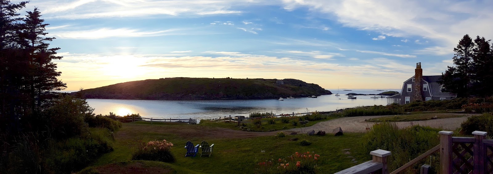
We rented a house with just the most wonderful peaceful view of the ocean and Manana Island just across from us as can be seen in the photo above. We brought much of our own food and everyone chipped in to cook and wash-up. It was such a delight!
This was the first time I have been able to experience plein air painting fully.
Monhegan is an island for artists. It is just 1 mile wide and 1 1/2 miles long. There are no cars on the island. In every conceiveable nook and corner of the island you will find an artist set up with their easel, painting away.
The first day or so, we spent walking the island, getting to know our surroundings and observing the light.
By the third day I decided that the light was best early morning, so for the rest of the week I was up before dawn to set up my easel. We could not have been luckier with the weather. It was perfect almost all of the week, apart for the last day when we experienced some fog.
Here are some of my paintings from the week. Some you will agree are more successful than others, but this week for me was about the learning experience. I learned to gain confidence with my set up, to paint faster and to eliminate what is not important. I leaned that I need to focus harder on how to achieve a better depth of field - something I will be determined to focus on on successive landscape painting trips.
Manana
My first and least favorite painting from the week. I painted this in bright, bright sunlight and thought I had painted a wide range of greens, until I brought it inside and it was clear I hadn't!
Although Manana island was very close by, I felt that the depth of field was not at all obvious. Something I need to work on.

Lighthouse at dawn
This was a total experiment. I got up well before dawn to start this painting. Around 4.30am.
I feel it was a partial success but I would like to attempt this again sometime. I want to achieve a more yellow hazy cast than I was able to here to capture the atmosphere of this scene at sunrise.
Two little boats at Fish Beach
Easily my favorite painting from the week.
I'm very happy with the composition in this one and I felt that I achieved a looser brush stroke and confidence with it.
The Barnacle
This one was a real challenge.
The perspective was tricky as I was fairly close-up to the cafe. Also as I was painting there was lot of coming and going of customers and staff!
It was such a pleasure painting in such close proximity of the ocean though.
The house we rented was rustic but charming and comfortable. We had electricity (though many houses did not) but the water was not drinkable so we bought water each day from the one small store on the island.
As well as the store, there is also an art gallery, a couple of gift shops, two hotels. A brewery, a pizza cafe and a seafood cafe.
Subscribe to:
Posts (Atom)